So, I've got a couple ideas for simplification, without loosing ability.
System Settings

This is what it currently looks like. There are two "Appearance and Behavior" sections. Also, there are too many options you'll never click.

This is my proposal.
Let's put all the personal options: IM, Account Details, and Personal Info into one place.
Let's break out passwords so that it's obvious we can control our passwords.
I'd pull out certain things and combine others in all areas; but I've not proposed any KCM be removed although I can't place Information Sources.
Most of the Network and Connectivity section can be rolled up into a Network item.
Shutdown


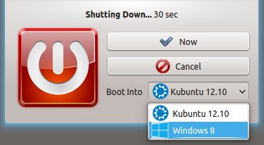
This is the current shutdown dialog. Note the options we already have chosen from. These three options are severely redundant and a bit confusing.
The other thing that felt out of place to me was the moon. Are we saying good night? It feels part of an astrological theme I wasn't aware I'd set my computer to.
However, I like the countdown attached to the "Are you sure?" dialog.
Also, It's not clear in the slightest what exactly those down arrows do. It requires you to hold the button down to open the menu. This is very bad design for such a button. If you don't immediately figure out how to get the menu to open, you have to wait for your computer to shutdown and reboot in order to try again.

Notice the simplified OS selection, like GRUB (v2) currently does. Advanced OS options are best left to the user to choose in the bootloader itself.
You may have noticed I've used widgets, this is not for any reason other than the fact that I know how to use Qt Designer and not Plasmate.
7 comments:
Great proposal. Hope this will be implemented in KDE 4.9.x
Well, perhaps if I got off my butt and actually coded this for real and engaged the developer community.
Perhaps I should.
Like the suggestions, especially about the shutdown options. I find the current setup to be cumbersome, way too many clicks needed for a very simple task.
System Settings is just way too messy so I agree 100 - please go ahead and do what you can to sort it out
Awesome the shutdown button thing was exactly what I thought!
You *definitely* should :) - these are great ideas that I think a lot of people would love to see in the next release.
If I recall correctly from editing a couple kcm*.desktop files (in /usr/share/kde4/services), the first one should be trivially easy to implement (albeit somewhat tedious). Something that stuck out to me in that first pair of screenshots was the centering of the header text, which got me thinking: Why not center the icons also? This would obviously require some not-so-trivial hacking on System Settings, but it might look better, and from a UI perspective, it would distinguish the interface from clicking files/folders in a file manager (and have the added benefit of making it look a bit less like an OSX clone ;) ). Also, I assume you're not actually proposing the removal of the search bar, right? If anything, it seems it should be made more prominent with this proposal.
As for the second proposal, all-around awesome. My biggest complaint with the current situation though, which this doesn't seem to solve (yet), is that if "Confirm logout" is disabled in the Session Management KCM, there's no way to choose which OS to reboot into. Also, last I checked, LightDM (which is set to be the default in Kubuntu 12.10) doesn't support selecting the reboot OS at all.
This is needed!
Post a Comment